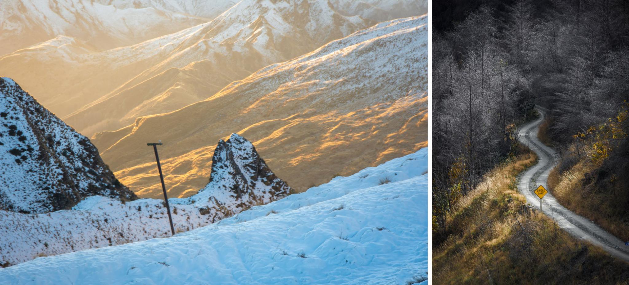
These images of Skippers Canyon are all about colour, texture and contrast.
(LEFT) Afternoon gold contrasts against icy blue. Dark, craggy rocks tower over quilted hills. The scene is very zoomed in, eliminating other mountains and the sky which would have reduced the scene's impact.
(RIGHT) A shot that contrasts the grey, spidery texture of the forest against the soft, gold of the trussocks below. The winding road with it's strong centreline pulls our attention in and connects the upper and lower regions. The small yellow road sign purposely centred in the image, grounds the composition and adds a layer of irony.
Being clear on what your image is trying convey is the key to it’s success. When you understand what draws you to shoot an image, you can use, your creativity, skills and knowledge to craft a successful result.
I spend a lot of time in incredible environments around Queenstown and Central Otago with people keen to improve their photography. It’s fascinating to watch their process of making an image. We’ll stop at an amazing scene, get our cameras out and often people will just point their camera in the general direction without really understanding why it attracted them in the first place.
People may have learned some of the well-known guidelines to composing images - the rule of thirds; leading lines or layering to name some and they will try applying one of these guidelines. This is going about image creation the wrong way. First, we must think about and understand what we are looking at.
Before we start composing it's important to identify the subject of the photo and the message we intend to convey. It helps to see the picture as made up of elements and to understand how these elements can be arranged to improve the image’s impact.

Three approaches to the same scene. (LEFT) Very wide view of an expansive mountain landscape, utilising leading lines (The road and diagonal edges of mountains lead the eye into the dark, the moody centre of the image, and the rock outcrop at the end of the road. (MIDDLE) An image about the layers of mountains fading into the distance and colours grading from gold in the foreground to distant blues. It is also about pattern and repetition - repeated shapes of mountain peaks directly behind each other. This image is anchored by the first of these peaks, the rocky outcrop with telegraph poles on each side. (RIGHT). Physically moving much closer we focus on the rock formation, its scale, and its dominance in the landscape, placing a human figure at its base to make the point.
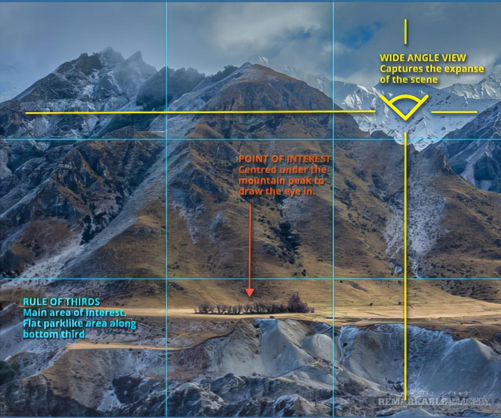
What are we looking at?
Skippers Canyon -a remote road built in the late 1800s.
Why is this interesting?
History. Man against the elements. Ruggedness, Remoteness. Cold. Beauty. Nature & the elements.
What caught my eye?
The unnaturally flat area between the base of a mountain and the “moonscape” below. The simple but beautiful colour palette.
Is there a story to be told?
All that remains of a gold mining settlement dating back 160 years - a cluster of trees, atop a parklike terrace - the land below blasted into a moonscape with water canyons.
What do I want people to understand or feel?
A sense of awe. The audacity of people against the power of nature. That which was once ugliness and destruction has been reclaimed by nature and now inspires us.
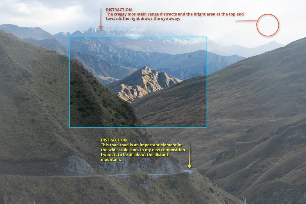
What is the most important element?
Already a great vista into Skippers Canyon. I want to focus on the craggy mountain in mid-distance. I’m fascinated by how it rears up dramatically and seems almost to be broken off.
Are there other elements that add something?
There are a number of interesting elements in this photo. To really focus on the mountain I am taking out the sky and the road because they distract from the impact I want for my chosen subject. This will make for a simpler and more powerful scene.
Is the subject enough to grab attention??
In the larger scene, the mountain that interests me is small and over-shadowed by other elements like the road and the craggy range on the skyline.
Eliminating distracting elements gives the image more impact.
Does the image need something else to make it work?
I shot from lower down to capture the grass below my feet This creates a foreground layer which anchors the image and creates a sense of the distance to the mountain.
NOTE: The final image has been post-processed in Adobe Lightroom to enhance the colour and tone differences even more.

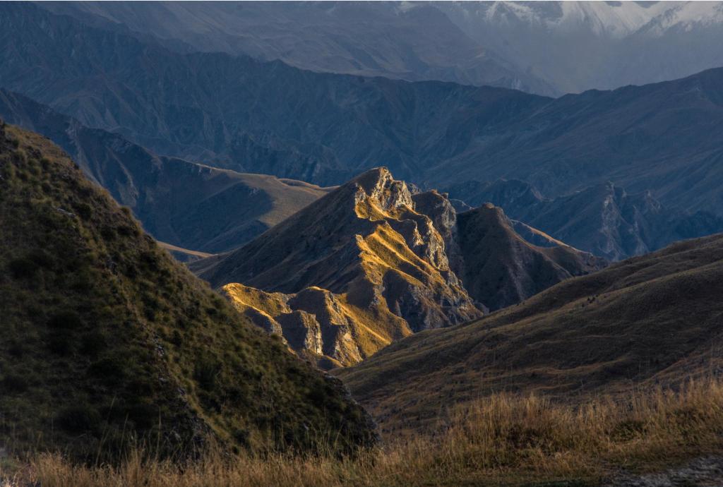
(Knowing when to just enjoy and walk away)
Can I make an impactful composition out of this? Sometimes the answer is no. There is a skill in knowing that, even though this scene interests or moves you, it is not going to translate into an impactful image inside a rectangle on a screen or piece of photographic paper.
The first step is to decide what in the scene is key.
The next is to exclude everything that doesn’t add to the image. Simplicity is always more powerful. Try to exclude anything that doesn't add to the image.
The first way to do this is to move the frame to arrange the elements so they work together. It might mean changing the angle of the camera, moving up or down, left or right to change the point of view slightly. Zooming in or out can also change what you include in the shot.
This is where the guidelines for composition can help you decide what elements should or shouldn’t be in the image and how to arrange parts of the picture to draw attention and create impact.
Cameras, themselves, give us a range of options for making our images communicate. Your choice of a lens affects the relationships of parts of an image to each other. A classic example is the sense of compression and therefore “drama” a long focal length (zoom) lens can bring to a landscape, or the way a single person or landform can be made to stand out in a scene by bringing them much into the foreground and pushing everything else into the distance.
Using shutter speed to capture a sense of movement or changing your aperture to separate foreground and background are examples of utilising settings to better tell a story.
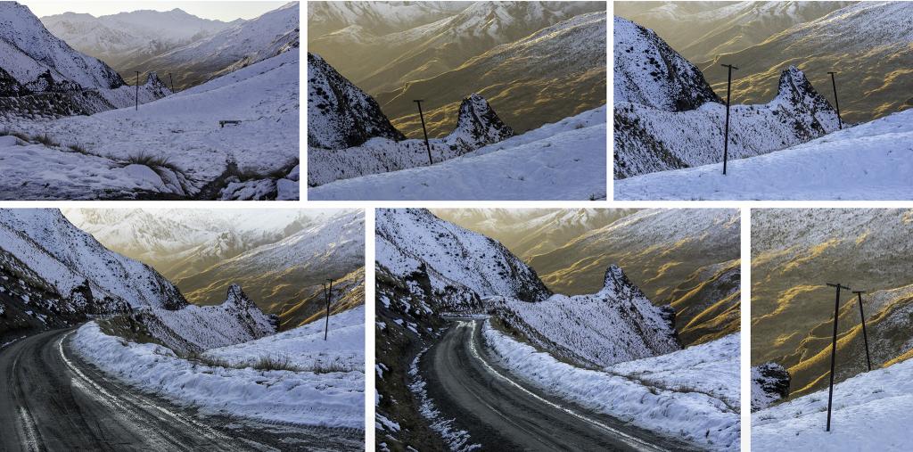
Many ways of photographing the same scene.
The focus can be the whole vista, the rock outcrop, the road leading in, the color contrast or the historic telegraph poles, a relic of the 1800s gold rush, during which this road was built.
When you understand what you are trying to communicate and have a clear intention you can begin to measure the success of the shot in front of you. It is then that you start “working” the scene, looking from new angles and different points of view; simplifying the image by removing distractions and building a composition by adding elements that draw the eye into the scene.
Come on a photography adventure with us. Explore extraordinary environments around Queenstown and The Southern Lakes of New Zealand. We'll take you to amazing places and work with you to understand what you are looking at so you can compose great images.
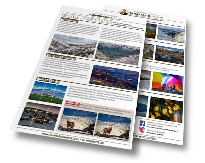
We include a take-home guide to camera settings and a guide to image composition.
